Neverwhere may be over 20 years but old a new, illustrated version has just come out — which gives me an excuse to extol the virtues of this wonderful book!
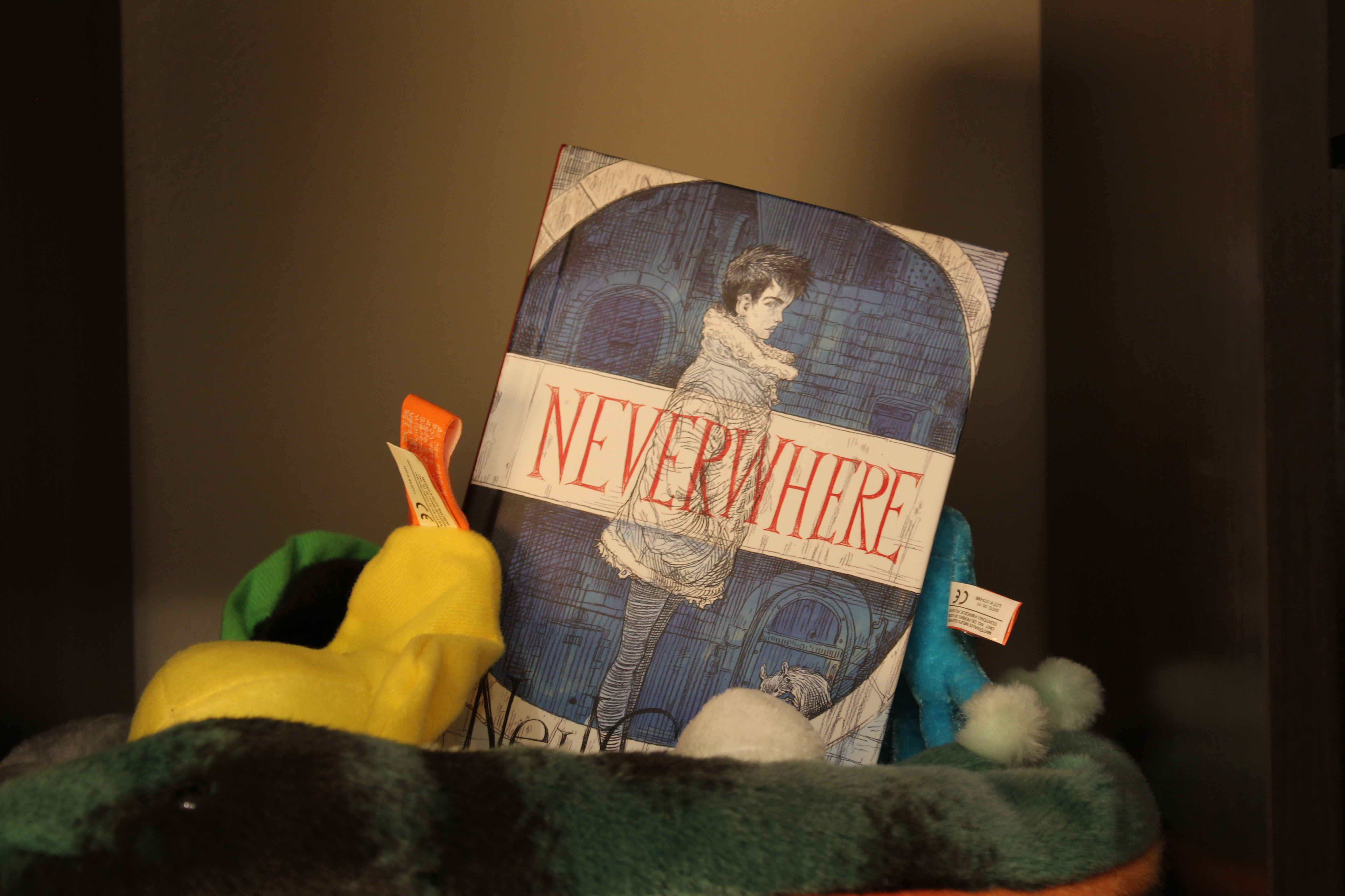
It is generally about a man who falls out of the world and into the “London Below” a fantastical world that lives alongside but unknown and unseen-able to the residents of “London Above” which he desperately wants to return to. As if this doesn’t pull him through enough of a threshold, he also gets tangled up with a mysterious girl name Door who is being hunted by two age-old killers, Mr. Croup and Mr. Vandemar.
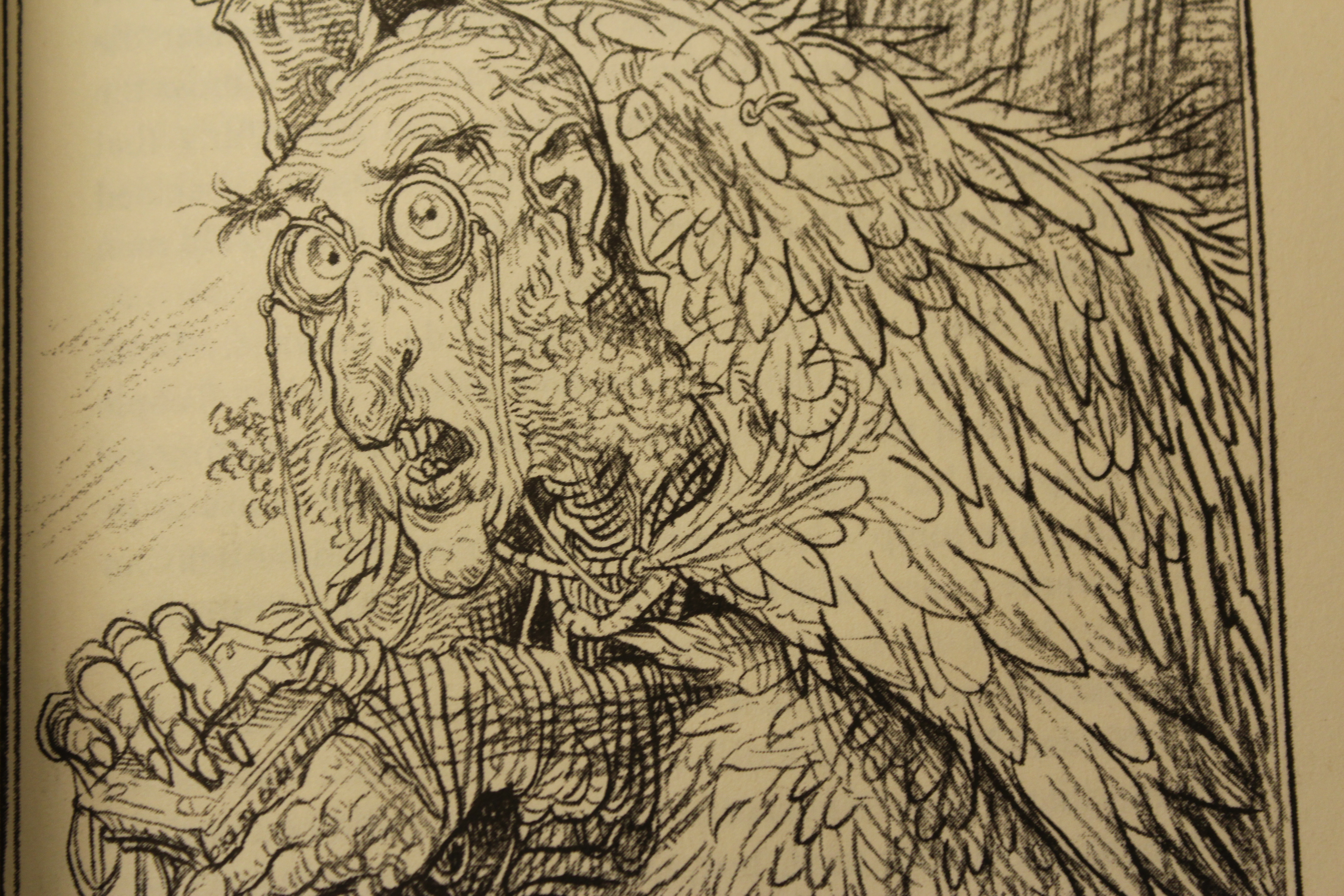
While the plot is good and tight, what makes Neverwhere truly fantastic is the world of “London Below” Neil Gaiman created. It’s filled with the lovingly created characters and places that our protagonists meet and visit on their journeys. Great characters include the Earl, who lives in a series of London Underground cars that have been transformed into feudalist estate complete with an open log fire, tapestries, herald, and wolf hound, and Old Bailey who is described as Robinson Crusoe covered in feathers living on top of a building in London. While, these characters in a short description seem kind of absurd, they don’t feel that way. Each fits in perfectly in the world of the novel and are described not like insane people but instead like lovable weirdos, and you leave each character and place just wanting to know more.
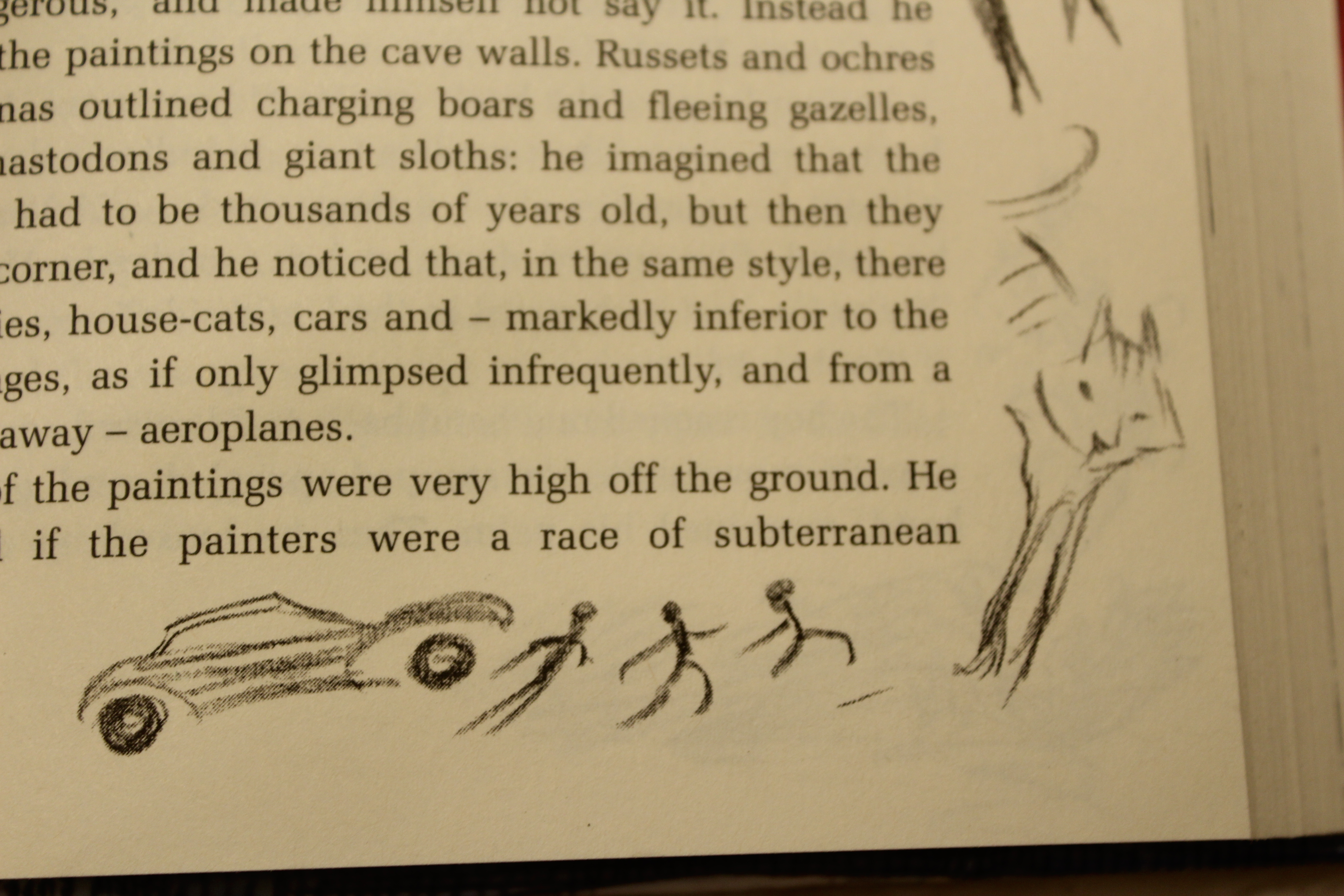
Well, I’ve talked enough about the book itself, so what about the illustrations? We’re here because of this new version, after all, so let’s discuss that I guess. To start, the illustrations themselves are excellent and prolific. There is at least some amount of illustration on every page. While they are all black line sketches, they come in all sorts of sizes, places on the page, and levels of finish. There are full intricate sketches of people or places in the novel and there are little atmospheric doodles between paragraphs or at the bottom of the page.
So, the illustrations are good, but do they make the book better? Uhhhhhhh… maybe for someone else? I had two issues with them.
The first will be familiar to anyone who’s seen a movie made based on a favorite book and thought that nothing looked like it was supposed to. I can’t really fault them for that though.
The second was that I often found the illustrations to be distracting. At times they were great! They made the book feel less like a novel and more like a journal, where some chronicler loving drew little doodles of what they were seeing as they wrote down the story, which I think this the vibe that they were going for. For the most part, though, I just found my eye drawn away from the words and to all the pictures when all I was trying to do was read the book. Then I’d be drawn out of the story and start staring at the weird looking guy on the metro. You know the one. He has his head completely shaved except for one bright red oval at the top of his head, and you think to yourself, “How do you even get that haircut? Did he tell his barber that he wanted it to look like he had a bloody pad stuck to his head at all times?” Then period man looks right back at you, and suddenly a picture in a book made you have an awkward time on your morning commute and you can’t focus at work.
Should you get the illustrated version? Well… maybe. If you are a huge fan of the book and just crave more content, go for it. If you don’t get distracted easily, don’t mind getting distracted, or maybe want to make friends with weirdos on a train, pick it up! But if I think for most people the normal non-illustrated version is likely where it’s at.

1 thought on “New ‘Neverwhere’ Illustrations: Fresh Addition or Distraction?”